Starting this piece i had no idea on the final outcome, so i started playing around with different shapes and colours to find some happy accidents.
1. Firstly i started by following the Adobe Illustrator tutorial showing me how to create a shape which included lots of overlapping lines.
2. I then transferred the object into Photoshop as i feel i can edit alot better on that software.
3. I then added a gradient going from white to light blue. At this point i decided to base the theme on the piece on ice and cold.
4. i then added a couple of textures over the gradient and changed the layer settings and opacity until i was happen with them.
5.Using what i learnt in the Illustrator tutorial i use a paint brush to highlight the object i imported with a white colour to make it imitate snow.
6. At this point i felt the whole piece needed a Hue Saturation on it to bring all the colours together.
7.Finally to i added the text "ICE" on the bottom right of the image as i felt that part of the piece was looking blank.
8. Changing the blending modes and opacity i made it look like the ice was fading into the background.
Monday, 15 October 2012
Tuesday, 25 September 2012
Font

Metal Lord Font, created by Ray Larabie 1996.
The main use of this font has been for the band Iron Maiden on the front of the albums and singles. I has also been used by games such as Grand Theift Auto 3 Vice City.
The way the letters have been warped and the way the extended Ascenders and Descenders look really make this font very unique. This to me is perfect to represent a great band like Iron Maiden.

This font is a Sans Serif style used for the film Total Recall. The font has a very simple look but thats what makes it feel futuristic. Also the shine effect used on the font makes its seem industrial.

AVP Movie font designed by Jens R. Ziehn. He has also designed fonts for another big films such as, Alien, Resisdant Evil and 28 days later.
This Font matches with the font extremely well. The simplicity and angles of the letters make it seem quite alien, which is what the film is about.
Wednesday, 19 September 2012
Tutorial Piece
Step-by-step guide on how i produced a space theme image.
I chose the theme space because of my love of astronomy and it also including very interesting imagery.
1. First of all i made my background layer black by selecting black in my colour swatches and hitting Alt and Backspace.
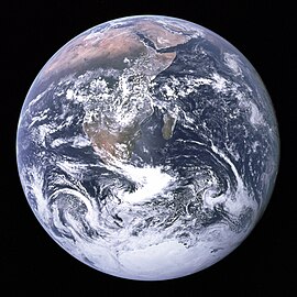
2. I then searched for some pictures of the Earth and Moon on Google images and found these.

3. I copied and pasted these images onto different layers and deleted the black background on each picture by using the Magic Erase Tool..
4. Once i positioned the 2 images i then added 2 lens flares to simulate large stars, and to also establish the direction of light. I did this by going into (Filter, Render, Lens Flare).
 5. After deciding which way the light was coming from i then added shadow to the 2 planets. This also made the planets look more spherical instead of just a flat circle image. I did this by using the brush tool and changing the opacity of the colour, then layering up the colour on the planet. Making the side furthest away from the light source more darker and gradually making it lighter as it came around the planet.

6.To make the lighting more dramatic I used Lighting Effects , (Filter, Render, Lighting Effects) on each planet. This made the shadow part of each plant darker and also made the lighter side alot brighter. This gave a greater contrast between the two sides of the planets.

7. The colour of the planets didn't look correct with respect to the colour of the stars shining on them. So i decided to change the Hue Saturation, (Ctrl + U) to add a light red tint to the planets.
8. After this i felt as if there needed to be more stars in the image but at a smaller scale, so I got and image off Google Images of stars.

9. I pasted this image onto a separate layer above all the layers i currently have. I then erased parts of the image using a soft brush at the parts were the stars were covering the planets and big stars.
10. Finally i stuck in some text at the bottom "Brave New World" which i found fits well with this image and also encourages people to think about the image a little more.
Finished Result.

I chose the theme space because of my love of astronomy and it also including very interesting imagery.
1. First of all i made my background layer black by selecting black in my colour swatches and hitting Alt and Backspace.
2. I then searched for some pictures of the Earth and Moon on Google images and found these.
3. I copied and pasted these images onto different layers and deleted the black background on each picture by using the Magic Erase Tool..
4. Once i positioned the 2 images i then added 2 lens flares to simulate large stars, and to also establish the direction of light. I did this by going into (Filter, Render, Lens Flare).


6.To make the lighting more dramatic I used Lighting Effects , (Filter, Render, Lighting Effects) on each planet. This made the shadow part of each plant darker and also made the lighter side alot brighter. This gave a greater contrast between the two sides of the planets.

8. After this i felt as if there needed to be more stars in the image but at a smaller scale, so I got and image off Google Images of stars.
9. I pasted this image onto a separate layer above all the layers i currently have. I then erased parts of the image using a soft brush at the parts were the stars were covering the planets and big stars.
10. Finally i stuck in some text at the bottom "Brave New World" which i found fits well with this image and also encourages people to think about the image a little more.
Finished Result.

Friday, 14 September 2012


This illistration is by Raphael Lacoste who is a enviromental concept artist.
This piece is my favorite from Raphael. He portrays the cold winter theme exremely well by his use of simplicity and making it look very barron. The Lighing is what gives the painting a secretive mood, as if it is some kind of goverment project which is my favorite element of the piece.

Subscribe to:
Posts (Atom)