Step-by-step guide on how i produced a space theme image.
I chose the theme space because of my love of astronomy and it also including very interesting imagery.
1. First of all i made my background layer black by selecting black in my colour swatches and hitting Alt and Backspace.
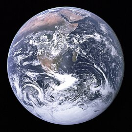
2. I then searched for some pictures of the Earth and Moon on Google images and found these.

3. I
copied and pasted these images onto different layers and deleted the black background on each picture by using the Magic Erase Tool..
4. Once i positioned the 2 images i then added 2 lens flares to simulate large stars, and to also establish the direction of light. I did this by going into (Filter, Render, Lens Flare).
5. After deciding which way the light was coming from i then added shadow to the 2 planets. This also made the planets look more spherical instead of just a flat circle image. I did this by using the brush tool and changing the opacity of the colour, then layering up the colour on the planet. Making the side furthest away from the light source more darker and gradually making it lighter as it came around the planet.
6.To make the lighting more dramatic I used Lighting Effects , (Filter, Render, Lighting Effects) on each planet. This made the shadow part of each plant darker and also made the lighter side alot brighter. This gave a greater contrast between the two sides of the planets.
7. The colour of the planets didn't look correct with respect to the colour of the stars shining on them. So i decided to change the Hue Saturation, (Ctrl + U) to add a light red tint to the planets.
8. After this i felt as if there needed to be more stars in the image but at a smaller scale, so I got and image off Google Images of stars.

9. I pasted this image onto a separate layer above all the layers i currently have. I then erased parts of the image using a soft brush at the parts were the stars were covering the planets and big stars.
10. Finally i stuck in some text at the bottom "Brave New World" which i found fits well with this image and also encourages people to think about the image a little more.
Finished Result.


